
Issue one Adverts
3 posters
Page 1 of 1

Issue one Adverts
![]() altheaquin Thu Mar 03, 2011 4:03 am
altheaquin Thu Mar 03, 2011 4:03 am
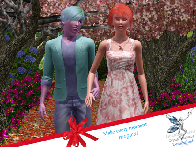
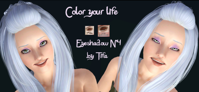
Ok here is the first of the adverts I've worked up. Comments? Suggestions??

altheaquin- Posts : 51
Join date : 2011-02-22
altheaquin- Posts : 51
Join date : 2011-02-22
Re: Issue one Adverts
![]() KyrstenA Thu Mar 03, 2011 3:38 pm
KyrstenA Thu Mar 03, 2011 3:38 pm
Fwah! They look great!! Man, I'm so excited to be a part of this magazine. We have so much talent here 
I love love love the background of the first one and the bottom part where it has the logo and the Make Every Moment Magical The only suggestion I have is that, at first glance, I couldn't tell what it was advertising and they don't look very intimate. Maybe instead, it could be closer to a head shot, Like maybe with his head around her neck... [pause] ... okay, I found this picture in one of my old Cosmos (
  ). I just took a picture with my phone, so disregard the quality.... And the sundaes... haha.
https://2img.net/h/i739.photobucket.com/albums/xx33/kyrstena15/0303111056.jpg
For the second one, maybe you could have one side that's completely black and white with a sad girl, then the "Color your life eyeshadow" slogan thing like you have it, and then the other side be a colorful Berry with insanely colorful eyeshadow. That way, you can still see the eyeshadow without having the model half-blinking. I don't even know if that would be a good idea, haha, but it might inspire a little more of the 'color' side of the advertisement. Here are a couple pictures I found that kind of shows what I'm talking about
https://2img.net/h/i739.photobucket.com/albums/xx33/kyrstena15/0303111115.jpg
https://2img.net/h/i739.photobucket.com/albums/xx33/kyrstena15/0303111114-1.jpg
https://2img.net/h/i739.photobucket.com/albums/xx33/kyrstena15/0303111120.jpg
Feel free to completely disregard all of my comments, too! I know that I love A LOT of feedback for my work, and I can never tell if other people do or not. I think both photos are gorgeous as is, too, so if they were to stay the same as you have them now, I think they'd be perfect for the magazine
I love love love the background of the first one and the bottom part where it has the logo and the Make Every Moment Magical
https://2img.net/h/i739.photobucket.com/albums/xx33/kyrstena15/0303111056.jpg
For the second one, maybe you could have one side that's completely black and white with a sad girl, then the "Color your life eyeshadow" slogan thing like you have it, and then the other side be a colorful Berry with insanely colorful eyeshadow. That way, you can still see the eyeshadow without having the model half-blinking. I don't even know if that would be a good idea, haha, but it might inspire a little more of the 'color' side of the advertisement. Here are a couple pictures I found that kind of shows what I'm talking about
https://2img.net/h/i739.photobucket.com/albums/xx33/kyrstena15/0303111115.jpg
https://2img.net/h/i739.photobucket.com/albums/xx33/kyrstena15/0303111114-1.jpg
https://2img.net/h/i739.photobucket.com/albums/xx33/kyrstena15/0303111120.jpg
Feel free to completely disregard all of my comments, too! I know that I love A LOT of feedback for my work, and I can never tell if other people do or not. I think both photos are gorgeous as is, too, so if they were to stay the same as you have them now, I think they'd be perfect for the magazine

KyrstenA- Admin
- Posts : 64
Join date : 2011-02-21
Age : 35
Location : Seattle, WA -


miadarkdecider- Admin
- Posts : 59
Join date : 2011-02-21
Age : 34
Location : Behind dark glasses.
» Issue One Cover
» Issue One Machinima Idears
» Issue one Photos
» Issue One Deadlines?
» Machinima Review Issue One
» Issue One Machinima Idears
» Issue one Photos
» Issue One Deadlines?
» Machinima Review Issue One
Page 1 of 1
Permissions in this forum:
You cannot reply to topics in this forum|
|
|